This was originally posted in the reddit r/TheSilphRoad feed back in 2016, but I wanted to move it someplace more easily accessible for archival purposes. The entire analysis was done in R.
Analysis of Pokemon Go Spawn Frequencies to Identify Possible Biomes
This analysis is based on spawns from the migration epoch starting 2016-08-23, many migrations ago. While the details of the biome regions and/or species assignment to biomes have likely changed since that epoch, I still think it’s interesting to see how ‘biomes’ may be represented in Pokemon Go.
Data set, from the Boston area
from the migration epoch starting 2016-08-23
17.5 million spawns
25,893 unique spawn locations
uniform high representation of each spawn location (e.g., not from user initiated scans); each spawn location contributed from 660 - 690 distinct hourly spawns
dataset kindly provided by /u/nevermyrealname
Approach
for each individual spawn location, determine the spawning frequency of each of 142 distinct pokemon
for each of the 142 pokemon species, identified the 57 species which at some spawn location, could have a spawn frequency of >20%
the spawn frequencies of those 57 species at each individual spawn location were the dataset to identify biomes
the remaining 85 ‘rare’ species were not used to identify biomes because their rarity would result in minimal contribution of information; e.g., charizard spawned only 31 times out of the 17.5 million spawns, and would add more noise than signal to identification of a biome
(however, after biome clusters were identified, I did analyze their distribution of spawn points – sneak peak: 94% of the 31 Charizard spawns did occur in a single identified ‘biome’ cluster)
K means clustering
- I used an ‘unsupervised machine learning’ technique called K means clustering to identify ‘clusters’ of spawn locations that were similar in the spawn frequencies of the 57 species
- I didn’t a priori know how many clusters there might be
- repeating K means clustering from 2 to 15 clusters identified the greatest decrease in within-cluster variation (a measure of how ‘well’ clustering is working) when ~5 or 6 clusters were used
- each of the 25,893 unique spawn locations was assigned to 1 of 6 clusters based on their pokemon species spawn frequencies
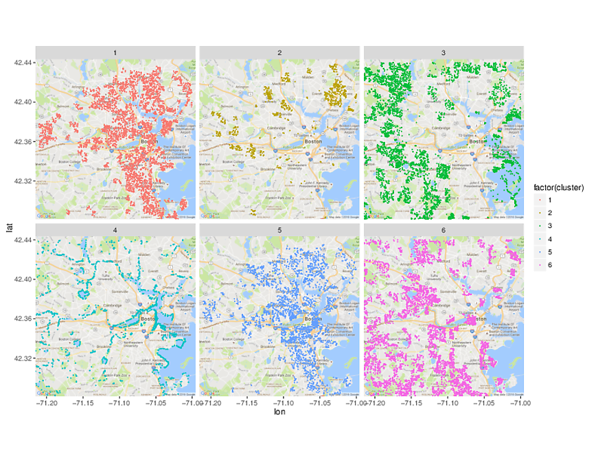
Geospatial visualization of spawn locations by cluster assignment
And now, the moment of truth. Do the unsupervised learning cluster assignments seem to make any sense?
Yes! The clusters do have geographic distributions that seem to make sense:
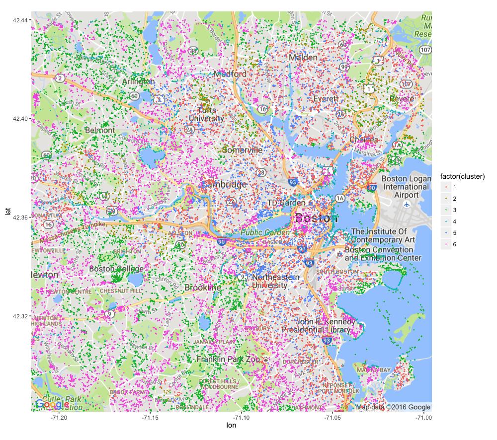
- Overlaying all 6 clusters shows how they fit together:
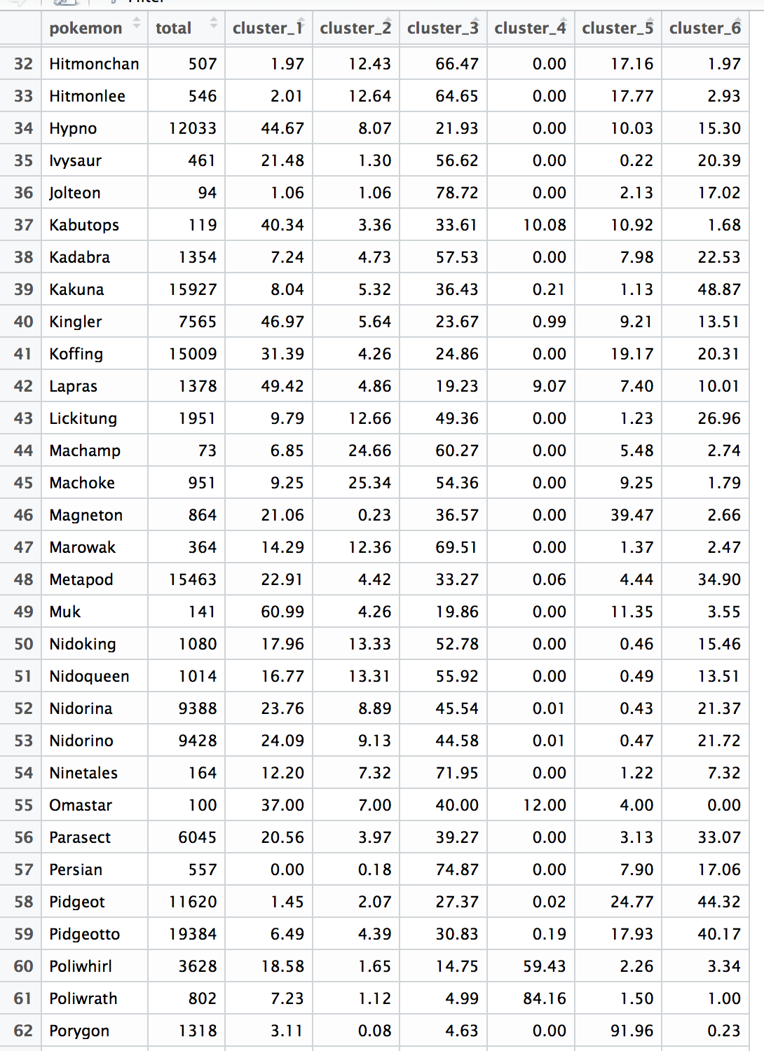
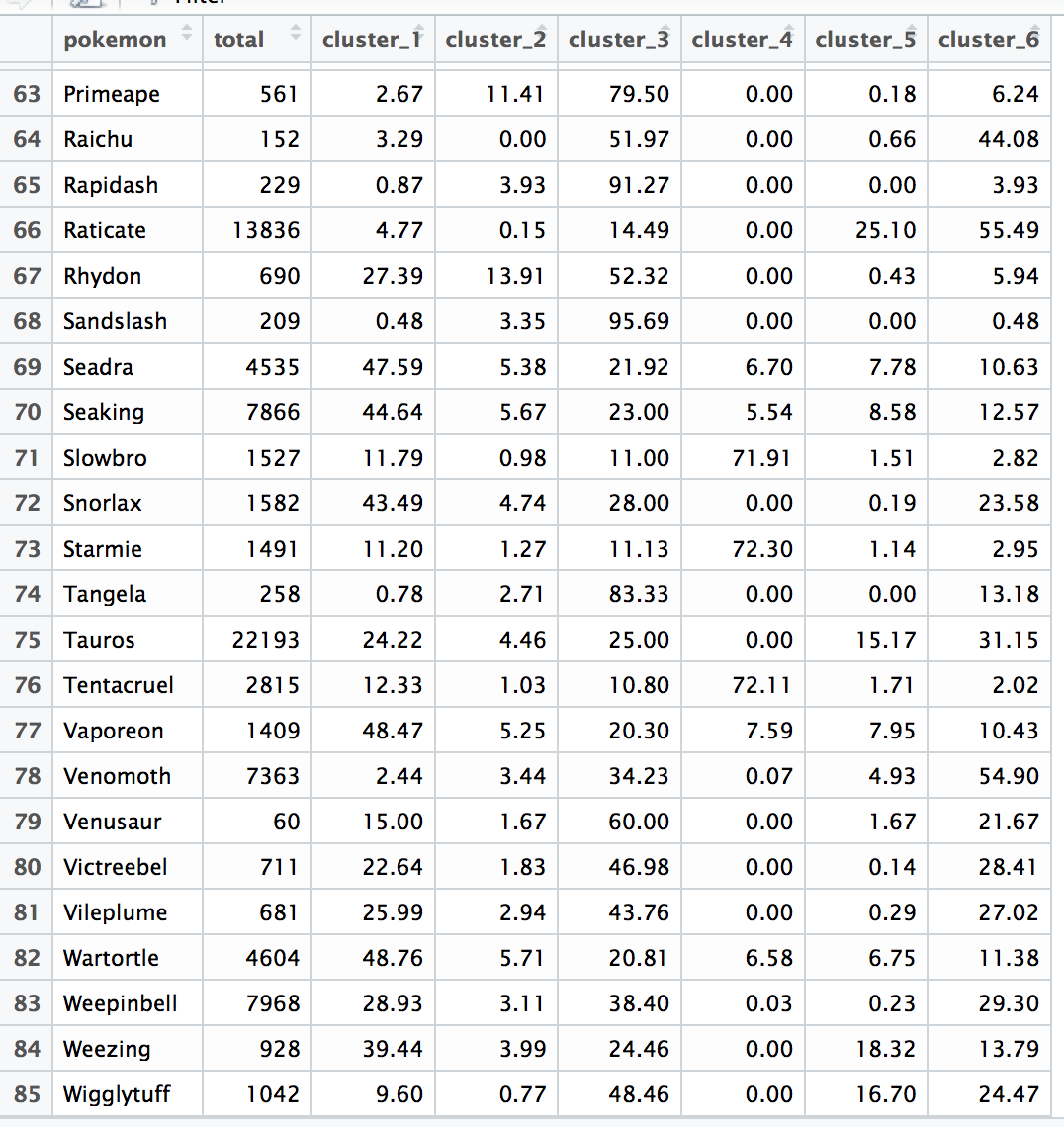
Distribution of Pokemon species within each cluster
- K means clustering assigned clusters based on the distribution of species spawn frequencies. The following image shows the “middle” of each of the clusters, with the spawn rates of each of the 57 species.
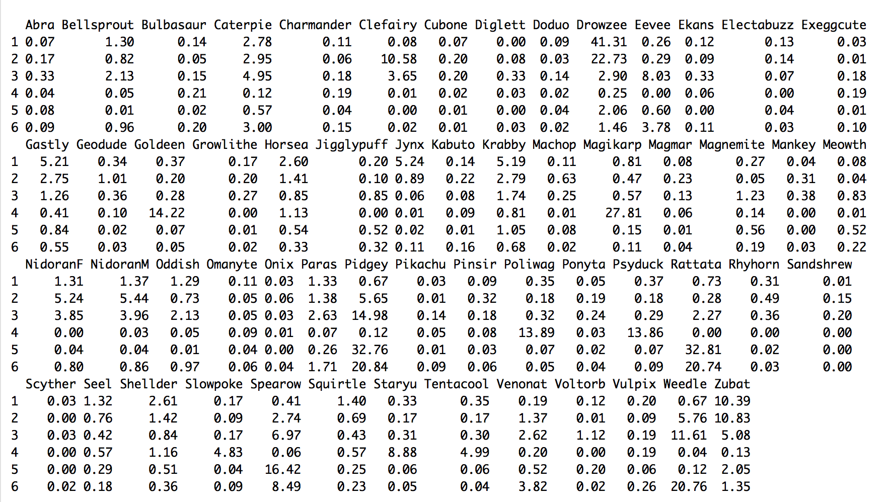
Inspection shows the differences in particular species, between the 6 different clusters.
It’s also interesting to note that although clusters #1 + #5 have geographic overlap, the species representation can differ quite a bit. For example, pidgey (0.67% vs. 32.8%); drowzee (41% vs. 2.1%); rattata (0.73% vs. 32.8%). So, spawn clusters #1 + #5 are distinct, even though they overly similar geographic regions.
Rare pokemon – do they spawn in particular clusters?
- I now went back to the 85 ‘rare’ species that were not used for identifying clusters, to see if when they do spawn, whether they trend towards particular clusters.
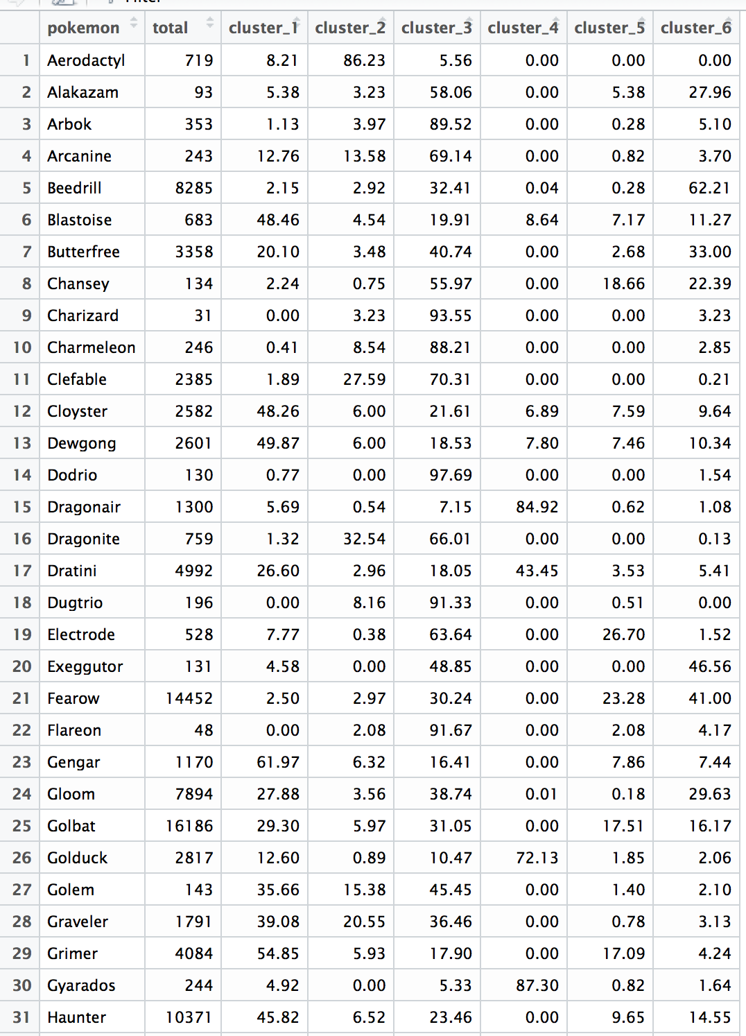
- As you can see, yes, many of the ‘rares’ do have a tendency towards particular biomes. For example, of the 17.5 million spawns documented, there were only 719 Aerodactyl spawns. Of those, 86% occurred at spawn points that had been assigned to cluster #2, some in clusters #1 and #3, and none at all at spawn points assigned to clusters #4, #5, or #6.
Non-cluster based analysis: spawn correlation matrices
Lastly, there’s another completely different approach to look at spawn tendencies, that is not related to clustering or attempting to identify biomes. In the future, practical data collection that does not violate Niantic TOS may be most amenable to analysis of correlations between different species spawn frequencies.
Here, for every individual spawn point and its associated species spawn frequencies, we look at all pair-wise comparisons of species and whether their spawn frequencies trend together or against each other.
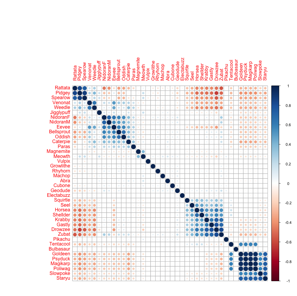
Blue is positive correlation, red is negative, and darker is stronger correlation.
Looking at the first row, example, you can see that where Rattatas spawn, Pidgey and Spearow are more likely to also spawn, but Zubat, Drowzee, Gastly, Krabby, etc. are less likely to spawn.
You can also see the species typically thought to be near water – Seel, Horsea, Shellder, Krabby, and, unexpectedly (to me anyway), Gastly, Drowzee, and Zubat – are positively correlated with each other.
The weakness of this correlation matrix analysis is that it doesn’t take into account potential biome clustering. Imagine a (made-up) scenario that in biome #1, Pidgeys are 100% associated with Zubat, but that in biome #2, Pidgeys are NEVER seen with Zubat, and that biomes #1 and #2 are equally represented. In this care, the two effects would likely cancel each other out, so no correlation would be seen. In this sort of situation, cluster analysis would do better.
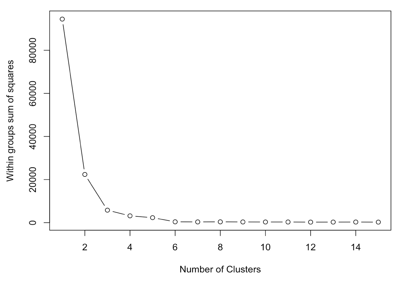
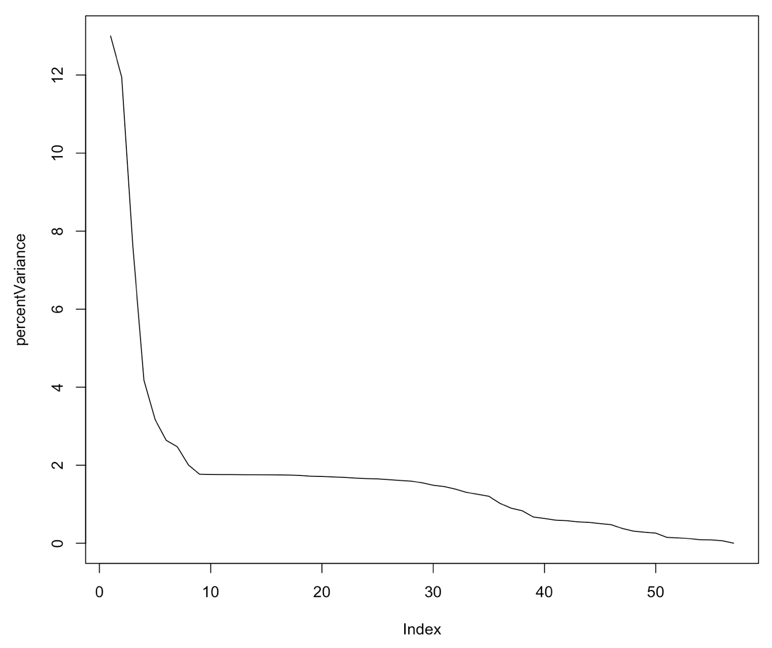
Explanation of choice of 6 clusters
- Here’s how within groups sum of squares differed, as the number of clusters was increased from 2 to 15. Most of the improvement occurs in the first 4 - 6 clusters.
- Another approach I took was to try principal component analysis (PCA) to see how many components of the spawn-frequency vectors would explain most of the variance. Again, it seems that the greatest explanation of the variance occurs in the first 5 or so principal components.
Caveats
Again, I’m a self-taught data analysis hobbyist, so it’s possible that I’m applying or interpreting the techniques incorrectly. But, I think the map plots are pretty convincing that I’m finding real clusters that likely correspond to what we think of as ‘biomes’ in Pokemon Go.
A bigger caveat is that all the data is obtained from a limited geographic region, around Boston. Places (like Southern California), Sandshrew can be the resident common vermin, yet I’ve managed to only catch one in the wild since August. So, clearly, there may be many more biome types in the game, that are completely unrepresented here.
Another obvious issue is that this is all data from MANY migrations ago. Previous analysis I posted showed that across migrations, spawn points are added + removed (and some remain). Niantic could very easily redefine what species belong to which biomes, add / remove biomes, etc. Still, I still think this analysis adds to a better understanding of what sort of approaches Niantic might be taking to Pokemon spawn variation mechanics.
I’ve intentionally not analyzed ‘nests’ here – my focus was more on the macro scale ‘biome’ / cluster analysis. I’ve posted separately how nests can change across migrations.
Incidentally, in no way do I condone violating Niantic terms of service, and I am against the use of bots / spoofing / etc. to gain an advantage over other players. On the other hand, I love digging into data analytics to try to figure out how things work. Similarly, GamePress’s wonderful catch mechanics analysis was also derived from a ‘dirty’ data source. The data used in this analysis is just so much bigger and complete than any that could be obtained fully legitimately, and it’s so far out-of-date that I do not expect that it will give any truly unfair advantage to me or others. But I do understand if some folks question my use of this data.
Anyway, hope you enjoyed this analysis!